Do you walk into rooms or open cupboards, then spend two minutes trying to remember why you’re there? Absent-minded moments happen to the best of us, but sometimes that momentary lapse leads to long term problems!
Such as, when you commission branding and overlook a crucial part of the process.
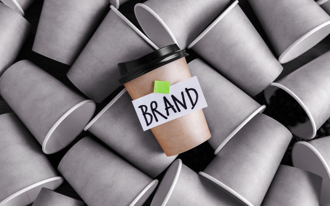
There are some jaw-dropping examples of when the aesthetics of a branding design covered over a gap where good sense should be. Or, when someone commissioning new branding simply forgot one of these crucial steps.
Consider hidden meanings
Who thinks the Amazon logo looks phallic? We put that politely, but the Internet has not been so kind.
That’s not the only branding that forgot about people’s ‘mucky minds’ either. Visit this site for some toe-curling examples of sexual logos!
It comes down to this – your branding graphics must reflect your company values, without triggering any negative connotations.
Think you’ll be able to look at those logos the same way ever again? Me neither!
Do market research
This is a key part of branding anyway, but it certainly helps you with the point above!
What seems a great idea to you, may prove to be a total mystery to your potential customers, or grate on them unpleasantly. If it’s too ambiguous or disliked, it’s not going to work in positioning and promoting your company properly.
You recognise the Mastercard logo anywhere, right?
After reading these branding insights, Google the giant financial organisation’s colossal mistake in 2006. $1.5m of new branding design that was an unsightly mess, and everyone hated it. Did they even do customer research?!
Reality-Visual check
We won’t wax lyrical about the meanings of colours as that’s fundamental to branding design. However, what’s easy to forget is something can ‘look good on paper’ but not in reality. For example, on shop fascias, fleet livery or staff uniforms.
Doing a field test of your branding design enables you to check for things like whether the colour combination looks overwhelming in harsh light, or hard to see from a distance or in poor light.
Don’t get TOO clever
Who remembers when Royal Mail went through a rebranding and became Consignia? Many creative hours went into a new name and logo. It means set apart, entrust, deliver blah blah blah.
£1.5m worth of brand design, which cost £1 million to scrap and revert to Royal Mail – which everyone understood and remembered easily. That was certainly a waste of time!
Sometimes, the thing that’s easy to forget is what’s already working for you. You can’t replace the elements of successful branding with highly intellectual solutions if you want to grow your company’s brand.
Refresh, not replace?
The same rule of thumb applies to the graphics used in branding. Just like the words, they must be backed up by sensible business arguments. No art for art’s sake, as the thinking behind your logo and corporate identity should be customer-centric.
Look at clothing firm Gap’s ‘fresh and contemporary’ logo design revisit in 2010. The spokesperson said it was ‘sexy and cool’. Consumer backlash was loud and undeniable, leading to a U-turn back to a trusted concept people connected with.
Branding that’s easy to see, hard to forget
We promise not to get TOO clever, but we will be creative, customer-centric and conscious of branding that’s 100% positive. It starts with getting an in-depth perspective of your organisation and its aims, and results in creating branding designs that work!
Well, that is rather clever really, but Creative Jam’s top branding experts make it look effortless.
If you’re in need of some top-notch branding design, get in touch with us today!